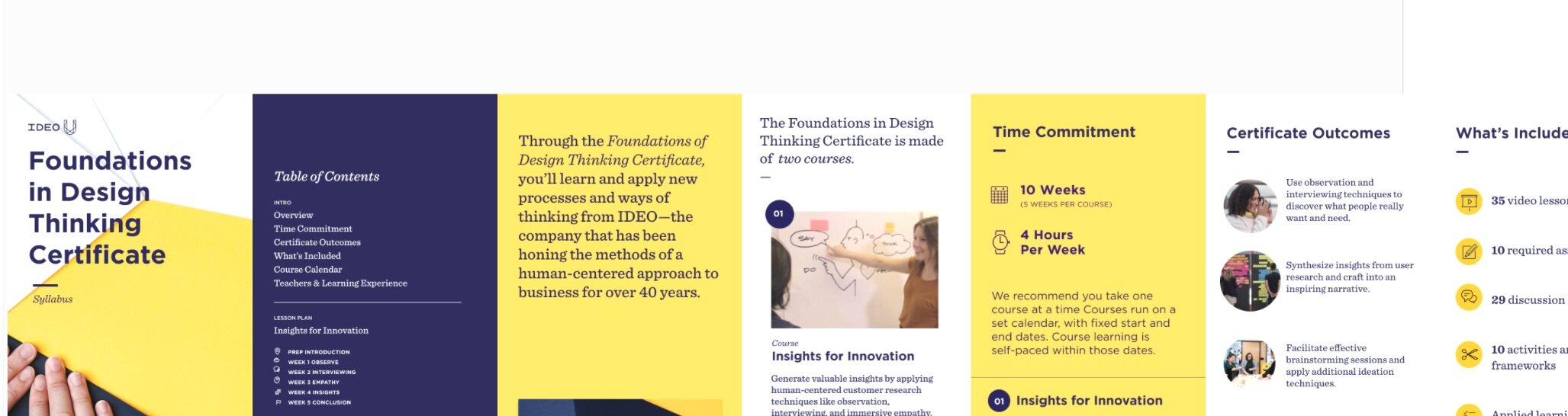
“Magic Silly Bus” - A Syllabus Project (IDEO U)
Challenge: There is an opportunity to improve the syllabus download-to-buy rate by uncovering insights re: the clarity and accessibility of our syllabus for those who are in the consideration phase.
My contribution: Design strategist on three person team (another strategist and a digital designer)
Impact: This project delivered a revised syllabus that emotionally connects, delivers on key moments at the right time, and serves multiple stakeholders on both mobile and desktop devices. An A/B/C test evaluating direct impact is still in progress.
Method: Individual and group user interviews, Expert interviews, Card Sort, Co-creation, Competitive Analysis, Internal Audit
Background
Since launching syllabi in March 2019, syllabi have been downloaded 91,000 times and can be attributed to ~$6M in revenue. In 2020, ~50% of those who purchase have previously downloaded a syllabus. What started out as a scrappy experiment has become a foundational component of our learner acquisition efforts.
Methodology
We started with an internal audit from key stakeholders, from marketing directors to customer support representatives, asking questions like: what is not working with the syllabus? What is the job of the syllabus? Six insightful hunches came out of this part of the research.
We did a competitive analysis against eight companies or academic institutions to ground ourselves in industry context and gain inspiration.
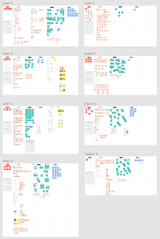
Working with our Chief of Staff, we screened and scheduled two existing super learners, two new prospective learners, and three industry experts from SuperHi, Outlier, and Coursera. We designed our sessions to include two main activities: 1) a low-fidelity cart sort to determine hierarchy and preferences for certain syllabus sections, and 2) a deep dive into five key sections that we co-designed with the interviewee.


Synthesis
This is the extra fun part for me. I’m at my best when there are post-it’s all around me - either physically or virtually - making up a sea of data. It’s messy, and my job is to pull it all apart and find the key insights. This is one of those moments where the work keeps me up at night. I talk it through with team members, let it marinate, come back to it, try a new way of categorizing, until the connections form and aha moments click.
Our synthesis revealed:
6 insights speaking to the job of the syllabus
5 design principles
3 insights speaking to the pre-syllabus moments
6 ‘moments that matter’ within the syllabus
A proposed hierarchy of syllabus sections based on card sort
4 surprising aha! moments
6 learnings on new ways of working internally to take into future projects

Outcomes
From this research, we felt confident there was enough evidence to roll out eight specific, actionable recommendations from changing the orientation of the syllabus to landscape to increase legibility and the mobile experience to creating a TLDR on page summary with key information at the start of the syllabus. This research also opened up nine opportunities to explore in the future, such as evolving the pdf syllabus format to a more current digital medium. We presented our findings to key stakeholders across IDEO U and received overwhelming positive feedback.
Next Steps
Taking these eight specific recommendations, we wrote a detailed creative brief for our designers to apply these findings into two new syllabus designs: one for mobile and one for desktop. This brief touched the hands of almost the entire marketing team to ensure alignment and clarity. After a couple design reviews, our first prototype was ready and we began another phase of research to test to validate the designs.
We designed two group user interview sessions - one for existing learners and one for new learners. I co-led these sessions with my colleague. In first session, we designed a virtual scavenger hunt to watch and probe at how users were searching for given information in the new syllabus design. In the second session, we asked users to dot vote across the design and engage in deep conversation about their thoughts and feelings, section by section. We synthesized the findings into a list of actionable changes to be made by our designer.
After edits and refinements, we A/B tested the two new syllabi against our control in an A/B/C test. The complexity of this test was high as we had to use our Hubspot integration to set up different workflows for each variation and work with our A/B testing partners and internal developers to make this happen successfully.
This test is still in progress. When results are in, this page will be updated. Wish us luck!